After deciding the topic, I establish my role in the project and plan for the estimated project progress.
I interview serval users & develop user story & problem statement in the persona of 2 users. Follow up with their User Journey maps. I also perform competitive audit to idenify potential competitions of our products.
Starting with competitive audits, I ideate the mainpage design. Then I start developing paper wireframes. Digital wireframes & low-fieldity prototype is then further develop & modify for a usability test.
According to the feedbacks form usbility test, I refine the design and add visual elements to produce mockup. Mockups are then converted to high-fieldity prototype.
Food allergy populations are suffered from limited food and bervage choices, and they can hardly enjoy tasty food with others.
The recipe site currently provide single food allergy filter instead of personalized filter, that they cannot find the recipe they need.
Design a cross-platform recipe site that provided specific aid to food allergy populations.
According to our interviewees, Helen & Mrs Wong. I built up personas for them and established their problem statements. Then I map Helen & Mrs. Wong's user journey to understand their experiences and opportunities for our design.
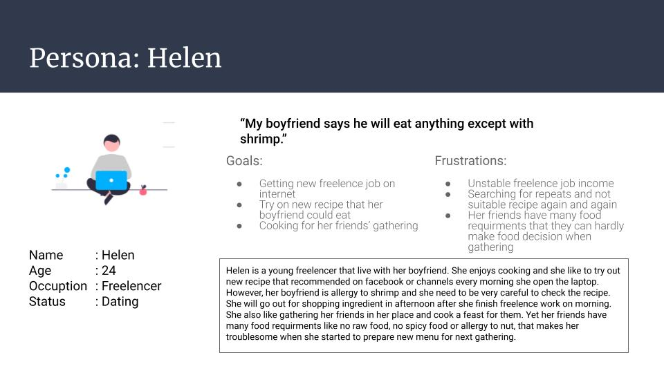
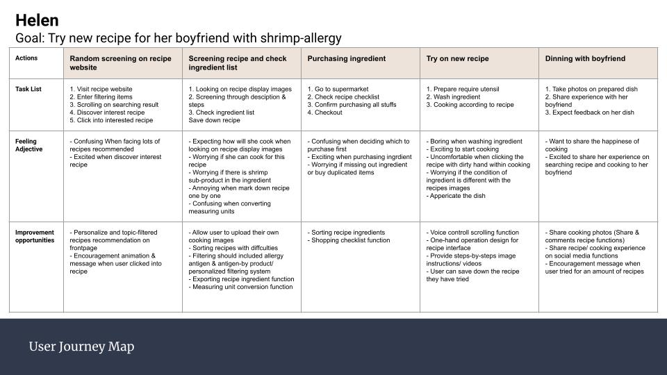
“Helen is a freelencer interested in cooking who need a way to filter recipes on internet becuase she want to search for suitable recipe in a fast and convenient way.”
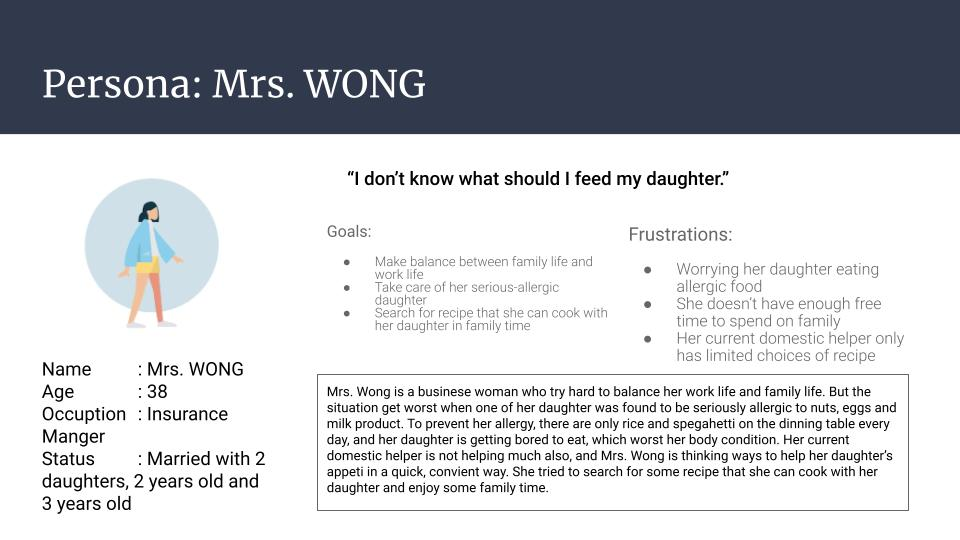
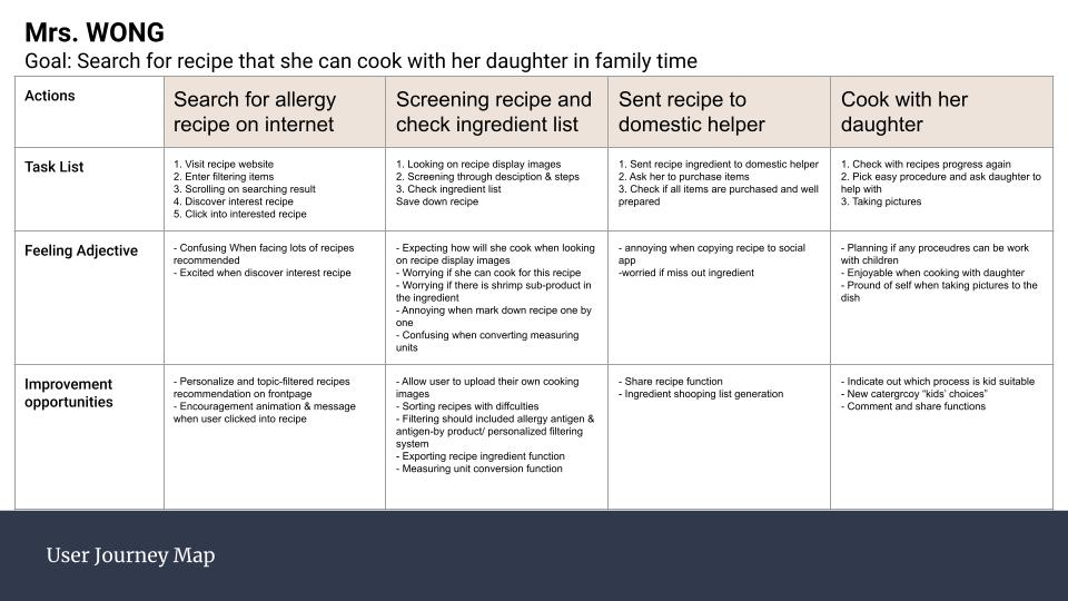
“Mrs. Wong is a busy mother who need a way to search for food-allergy specific recipe for her daughter becuase she wants to let her daughter try on more different food and have a balancing diet.”
I performed a competitive audit to idenify our product's potential competitors, then learn & make improvements to our own design.

Detail kids recipe & filters

Powerful & highest variety of filters.

Stylish layout & attracting recipes recommendations.

Outstanding design and great UX for searching recipes.
I ideated 5 random frontpage designs & picked the best part in each desgin to merge as the final design decision.
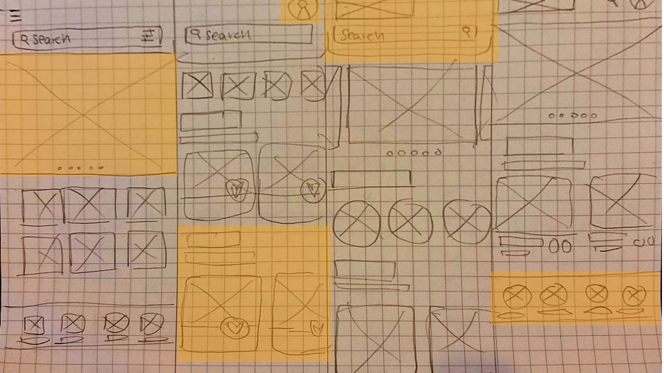
After brainstorming, I draw a paper wireframe for the COOkbook 's mobile app frontpage which include the best from the brainstorming wireframes.
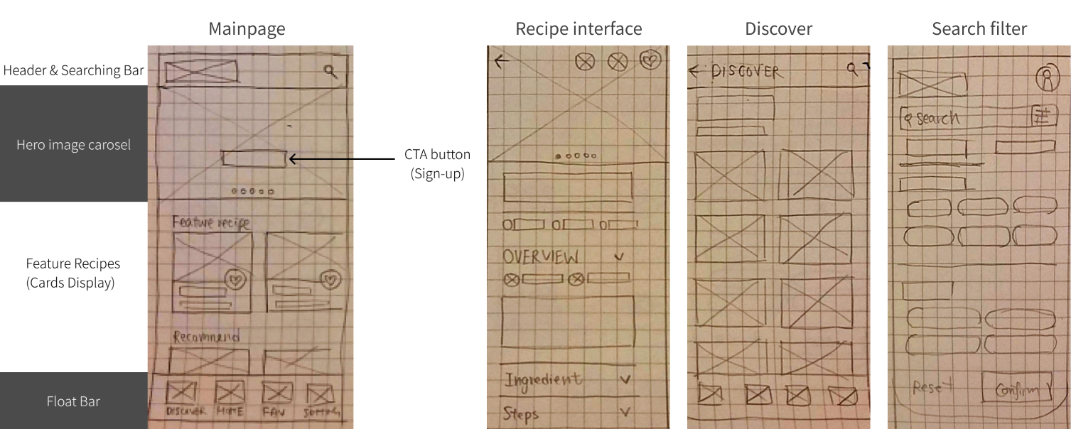
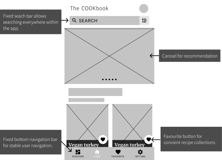
Continue the initial design process, I develop the digital wireframe and add new features that facilate user to distingush different parts on the front page .Then I develop the digital wireframes in Figma.
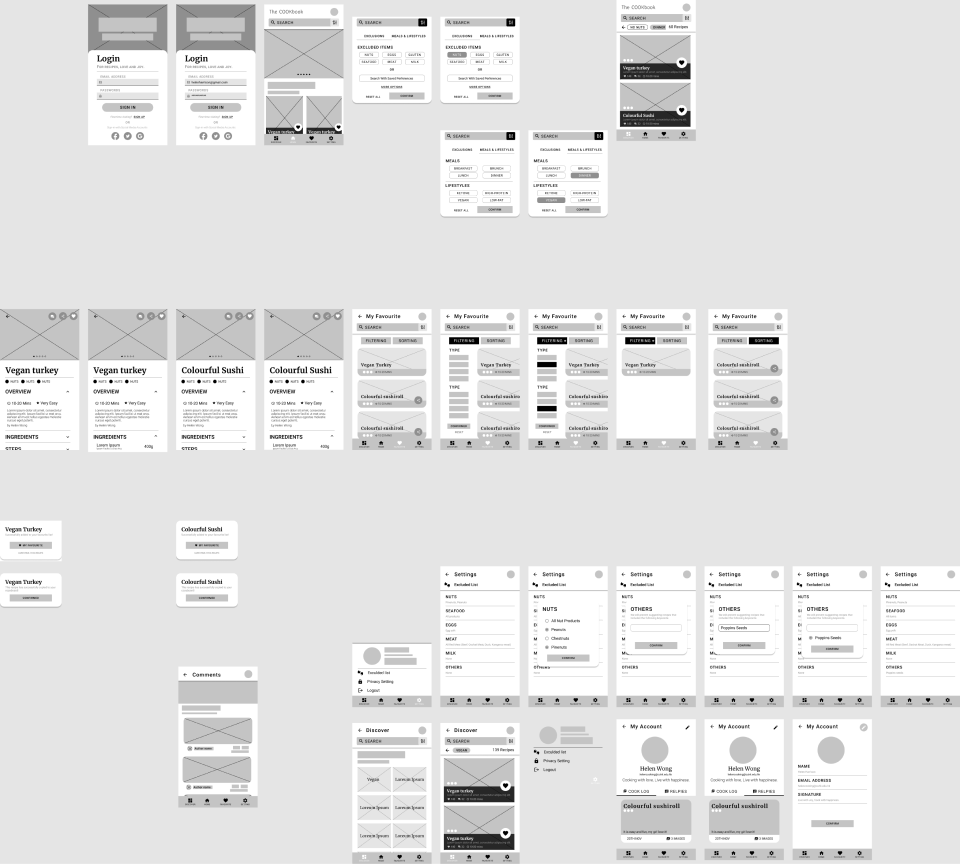
This Low-Fidelity prototype briely show the user flow from frontpage, undergoing the registeration process, and finally reaching the mainpage.
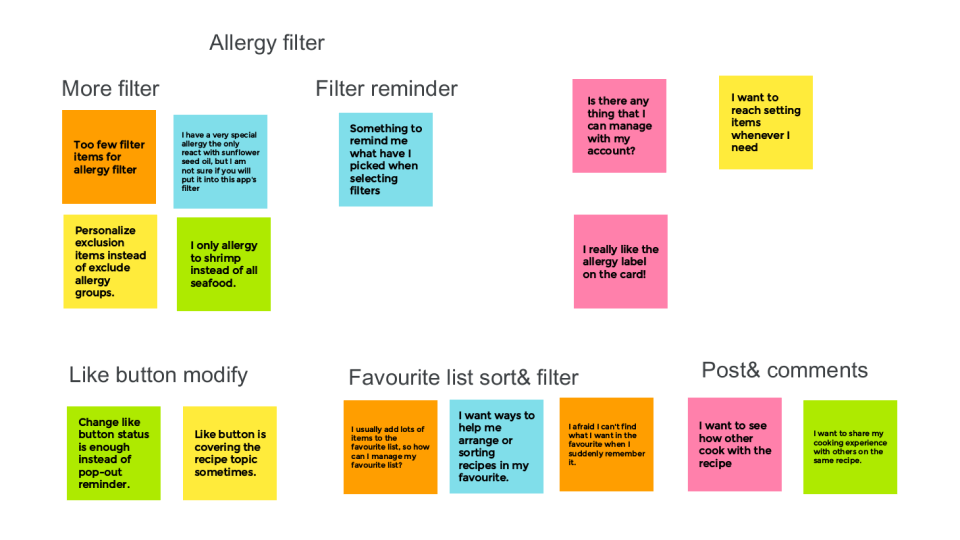
I consturct affinity graph according to users' opinions in the usability study, then insights are idenified and draw out modification directions.
An umoderated usbility study is performed to find out screens or userflow related problems. Findings are given out for second round of modifications.
Users want to comment & reponse to other users cooking experience on the recipe.
Users want to have a more personalized, mix-and-match filtering systems when searching for new recipe or saved recipes.
Users would like to reach setting options in a more convient way.
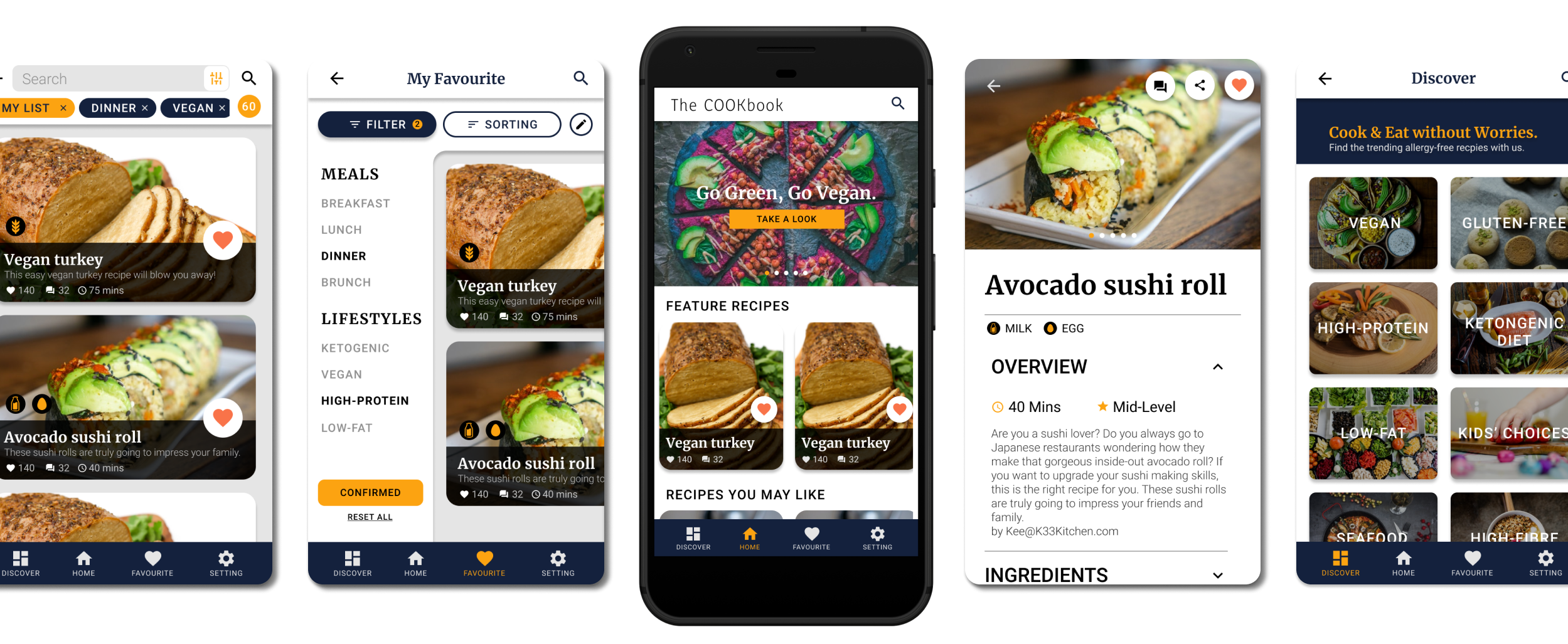
The mockups have tackled the problems that we discoverd in the usability study and adding with visual elements.
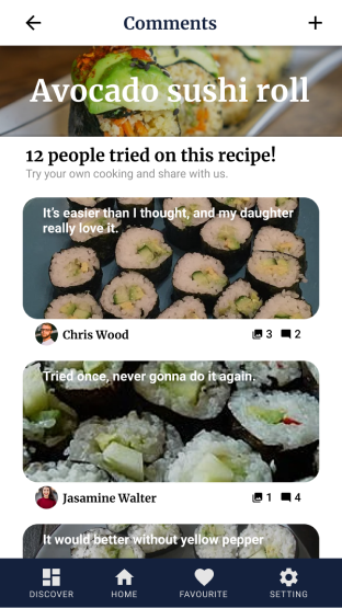
Users can leave comments on their cooking experiences and reply to others comments.
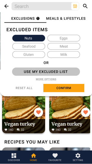
User can mix-and-match their allergy exclusion in the seraching filters, or pre-saved oersonalized excluded list for seaching.
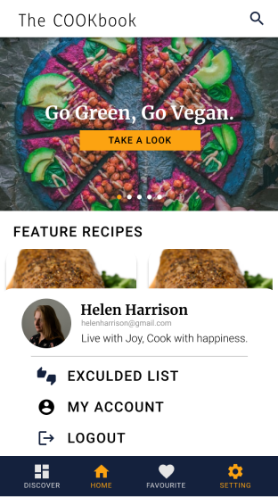
Pop-out setting section allows user to reach setting options without leaving current page.

Users can leave comments on their cooking experiences and reply to others comments.

User can mix-and-match their allergy exclusion in the seraching filters, or pre-saved oersonalized excluded list for seaching.

Pop-out setting section allows user to reach setting options without leaving current page.
In the mockup phase, I also optimized the responsive design to each screens. I idenitied different features & user need in each devices and make fine tunnings.
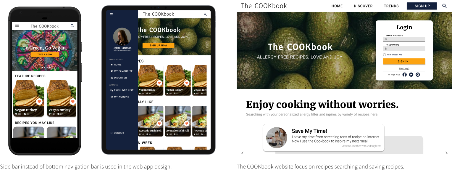
This high-fidelity prototype has tackled the problems that we discoverd in the usability study and adding with visual elements.
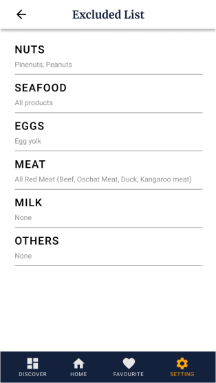
User can pre-save their allergy items and not need to repeat picking allergy filters in further searching.
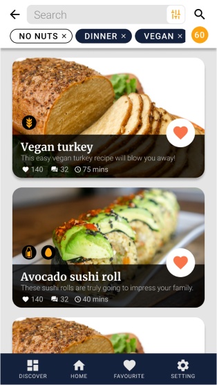
All recipes will be labeled with potential allergy ingredient label, which can be easily identified in the seraching results interface.
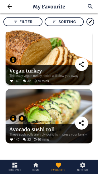
Users can save recipes by clicking favourite button on the result page, and export the recipes to text or social media by clicking on sharing button.

User can pre-save their allergy items and not need to repeat picking allergy filters in further searching.

All recipes will be labeled with potential allergy ingredient label, which can be easily identified in the seraching results interface.

Users can save recipes by clicking favourite button on the result page, and export the recipes to text or social media by clicking on sharing button.