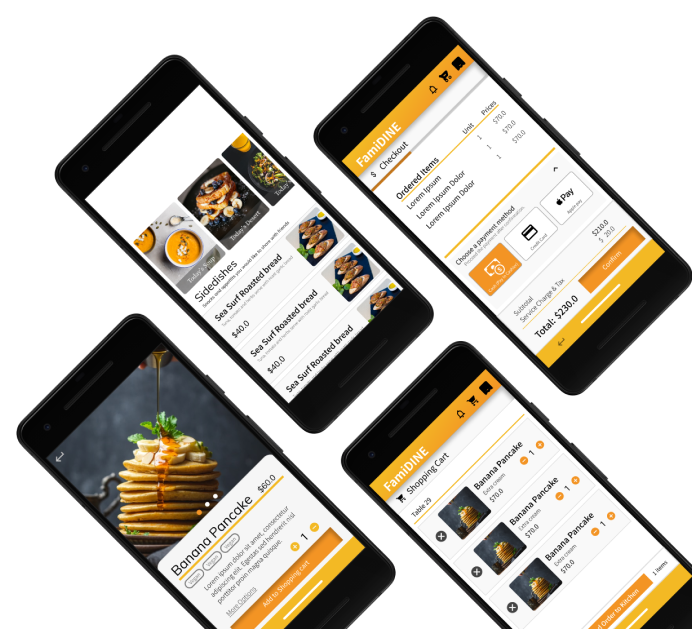
After deciding the topic, I establish my role in the project and plan for the estimated project progress.
I interview serval users & understand their painpoints. Then I develop their user story & problem statement in the persona. Follow up with User Journey map.
Starting with paper wireframes, I them develop digital wireframes & low-fieldity prototype for usability test.
According to the feedbacks form usbility test, I refine the design and add visual elements to produce mockup. Mockups are then converted to high-fieldity prototype.
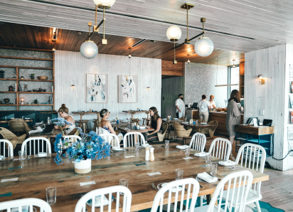
The ordering and service system of the family restaurant now is not enough to support family customers and young customers' need.
Designing a menu and ordering app, FamiDINE, for family restaurant that support extra services and customers' requirements.
According to one of our interviewees, Mrs Wong. I build up a persona for her and established her problem statement.
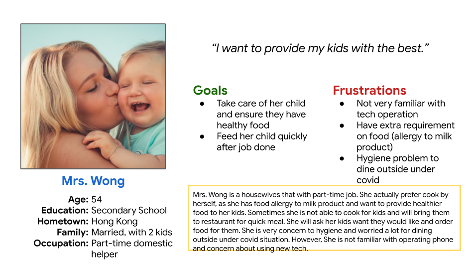
“Mrs. Wong is a housewife who needs to feed her 2 children quickly because she is tired after work.”
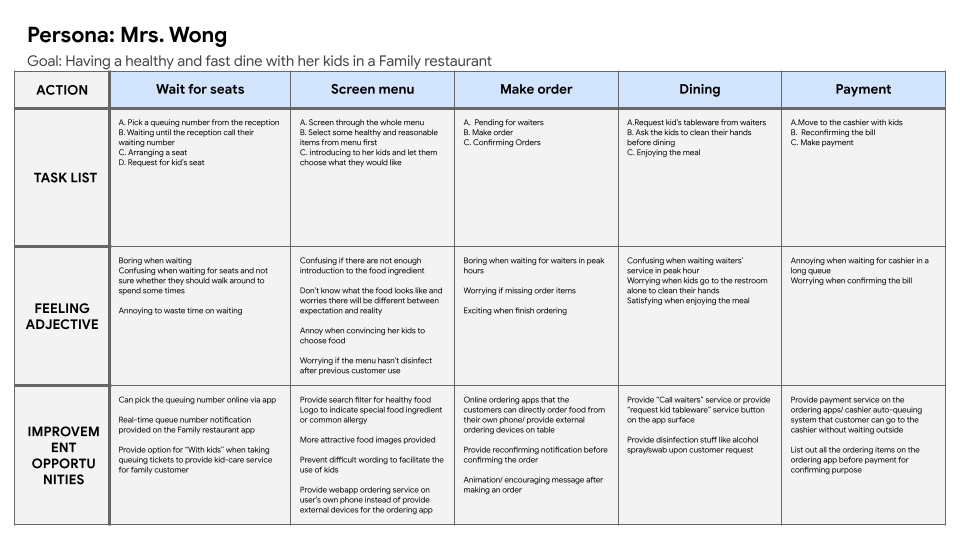
Mapping Mrs. Wong's user journey to understand her experience and opportunities for our design.
I interview users & idenitify their painpoints.
Not many restaurants provide kid services to family customers, like kids seat and tableware.
Customers are not sure the menu items fulfill their special food need when dining outside.
Spending much time on waiting waiter services or pending table in peak hours.
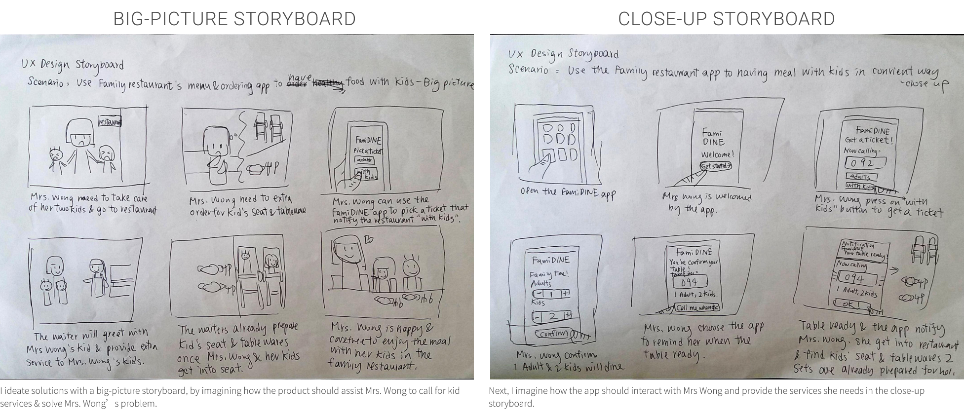
I start to ideate how to solve Mrs Wong probelm and develop story boards.
I design the main function interfaces first and ensure all the main functions are include in the design.

I keep some of the key components and try to keep the interface clean and easy to access. Then I develop the wireframe in Figma.
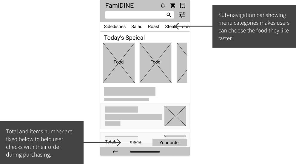
This Low-Fidelity prototype briefly show the user flow from pending table in the ticket-pending system, screening menu, make an order and check out for payment process.
An umoderated usbility study is performed to find out screens or userflow related problems. Findings are given out for second round of modifications.
Users want guidance to shopping cart after they add some items on the home screen.
Users feel messy when going from shopping cart to checkout process.
Spending much time on waiting waiter services or pending table in peak hours.
The mockups have tackled the problems that we discoverd in the usability study and adding with visual elements.
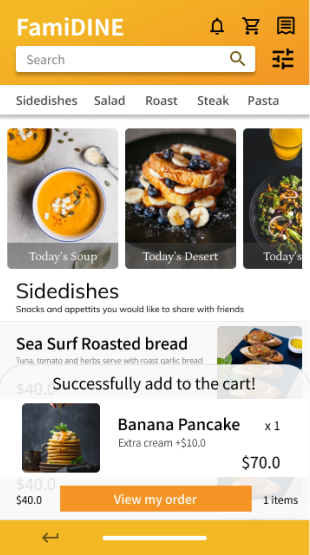
Action success pop-out & CTA button for shopping cart guiding user to shopping cart after adding item.
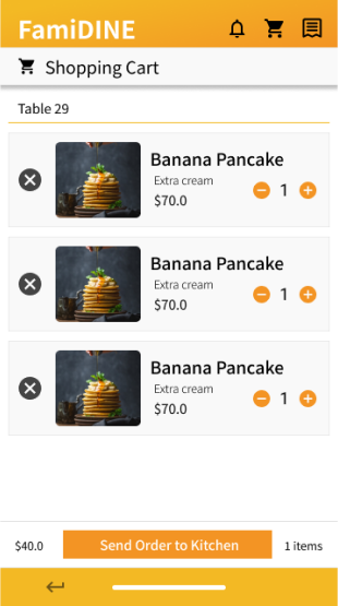
Users can add mutiple items to shopping cart & send order together to confirm order.
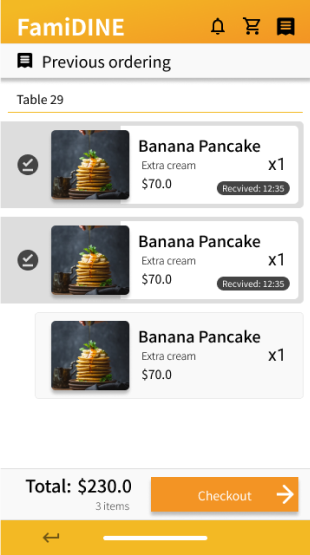
Bottom status bar of previous ordering has been changed to make different with shopping cart bottom bar.

Action success pop-out & CTA button for shopping cart guiding user to shopping cart after adding item.

Users can add mutiple items to shopping cart & send order together to confirm order.

Bottom status bar of previous ordering has been changed to make different with shopping cart bottom bar.
This Low-Fidelity prototype has tackled the problems that we discoverd in the usability study and adding with visual elements.
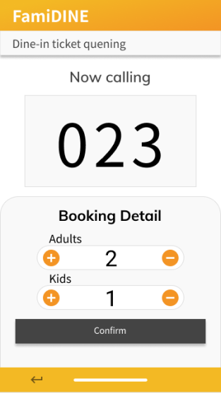
Family users can pre-ordering table & inform restaurant that they are with kids, so that the restaurant can response with kid services in arrival.
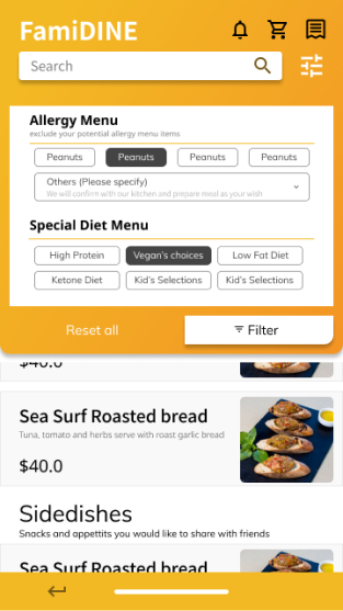
Users can select food with mix-and-match filters to fulfill the requirments from both children & parents.
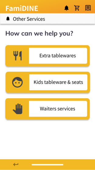
Users can request waiter services without leaving the table, so that they can look after their kids.

Family users can pre-ordering table & inform restaurant that they are with kids, so that the restaurant can response with kid services in arrival.

Users can select food with mix-and-match filters to fulfill the requirments from both children & parents.

Users can request waiter services without leaving the table, so that they can look after their kids.