After deciding the topic, I establish my role in the project and plan for the estimated project progress.
I interview serval users & understand their painpoints. Then I develop empathy map, user story & problem statement in the persona. Follow up with User Journey map.
Starting with user painpoints & improvements, I construct a site map. Then I start developing paper wireframes. Digital wireframes & low-fieldity prototype is then further develop & modify for a usability test.
According to the feedbacks form usbility test, I refine the design and add visual elements to produce mockup. Mockups are then converted to high-fieldity prototype.
Gardeners are usually not young and thus not familiar with web or mobile operations.
They are lacking of a platform to meet with others that share same gardening interest.
The current gardening forum focusing on socialing instead of gardening knowledge, which is inconvient to search for gardening tips.
Design a information-based social platform, that facilate users to search with gardening tips they like, then build up relationships with people that share similar opinions.
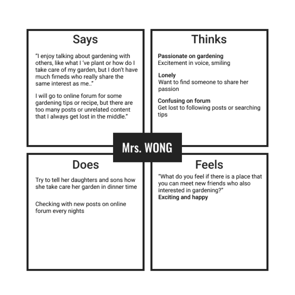
After interviewing with users, I constructed an empathy map by the interactions of user.
According to one of our interviewees, Mrs Wong. I built up a persona for her and established her problem statement.
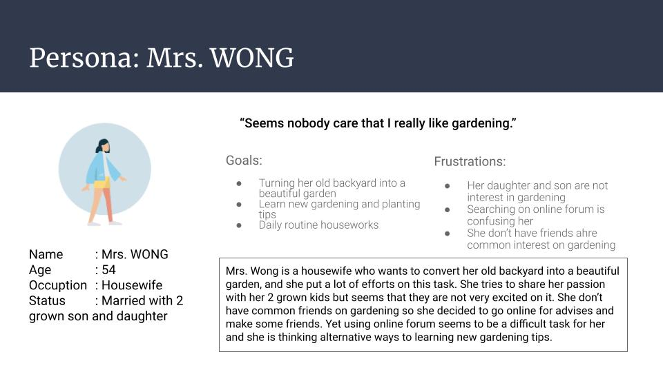
“Mrs. Wong is a housewife interested in gardening who need a easy-to-use gardening social platform becuase she want to make friends sharing with gardening interest.”
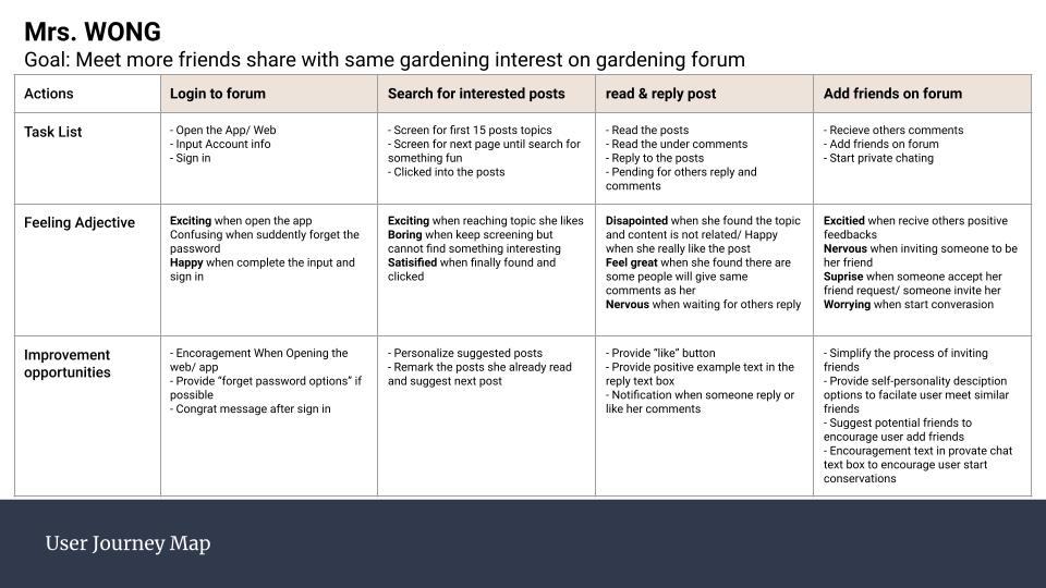
Mapping Mrs. Wong's user journey to understand her experiences and opportunities for our further design development.
After investigating users' experiences, I identified their painpoints.
The current gardener social platform make users confuse when searching for specific type of gardening information.
User want to have more and deeper communications with other users on the platform.
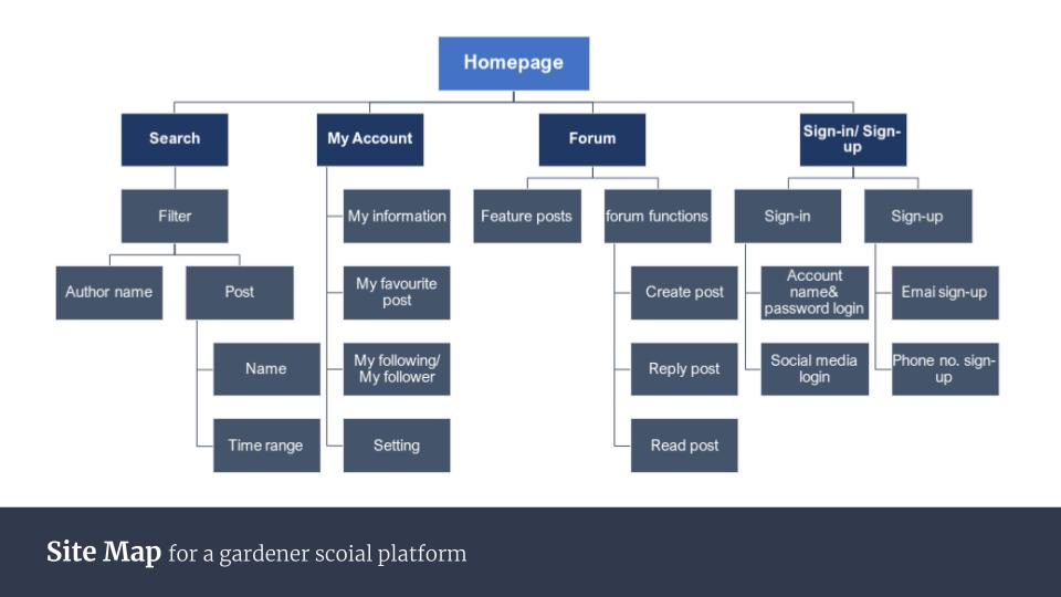
From the oppotunities & improvements from the user journey map and painpoints identified, I developed a site map for our further design pathway.
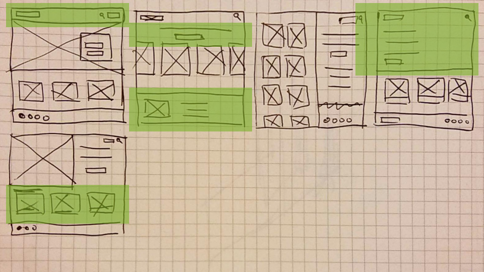
I ideate 5 random front page design & pick the best part in each desgin to merge as the final design decision.
I design the main function interfaces first and ensure all the main functions are include in the design.
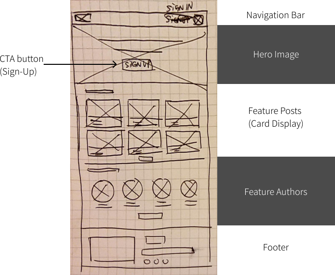
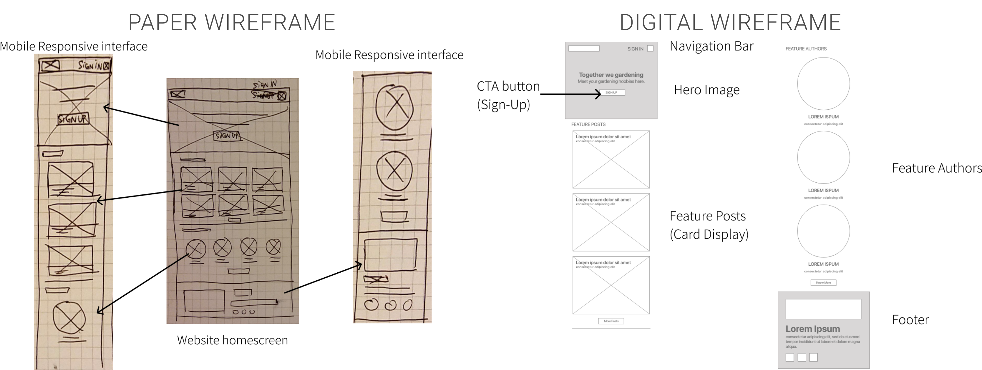
Keeping the key components and make sure the interface clean and easy to access. Then I developed the wireframes in Abode XD.
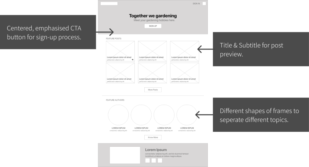
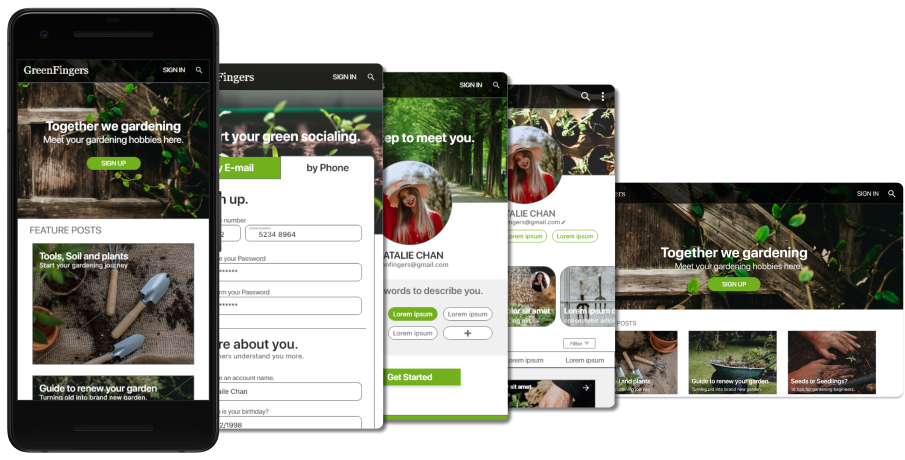
GreenFingers users may access the site on a variety of different devices, and I worked on additional screen sizes design planning for possible responsive design.
This Low-Fidelity prototype briely show the user flow from frontpage, undergoing the registeration process, and finally reaching the mainpage.
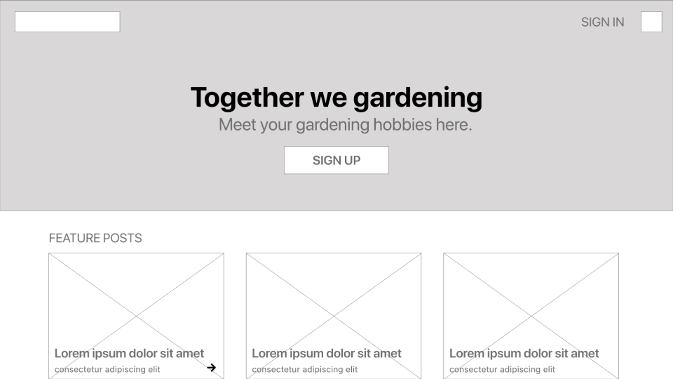
An umoderated usbility study is performed to find out screens or userflow related problems. Findings are given out for second round of modifications.
Users want to combine 2 forms into 1 form to reduce redunancy.
User want a more emphaised sign-up button.
“Sign-in” Option should be removed after user confirm to sign up.Mainpage functions can be included into a pull-down menu.
The mockups have tackled the problems that we discoverd in the usability study and adding with visual elements.
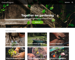
The CTA button is changed into an oval shape & with primary colour which create focal point on the frontpage.
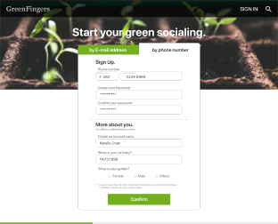
2 forms are cominded into single from to reduce steps in the account creation flow.
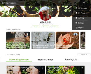
Mainpages functions are included in the pull down menu to make the interface simple & clear.
In the mockup phase, I also optimize the responsive design to each screen and make fine adjustments for improving user experiences.
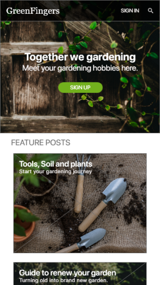
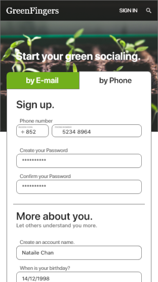
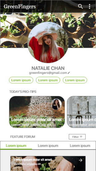


This High-fidelity prototype has tackled the problems that we discoverd in the usability study and adding with visual elements.
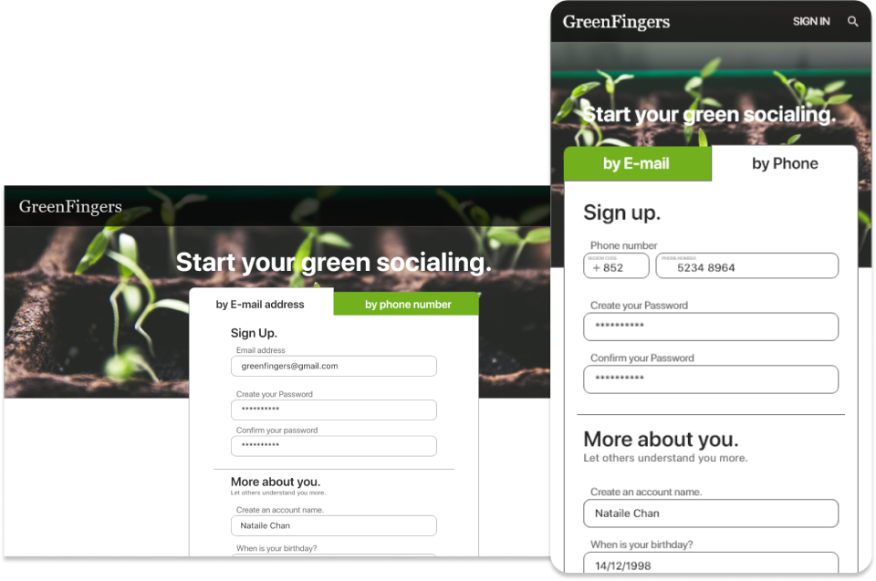
Alternative sign-up methods on different devices for users to choices.
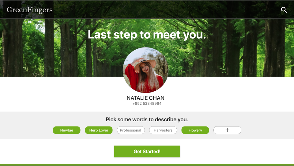
Personalities labels are used to recommend similar users with common interested.
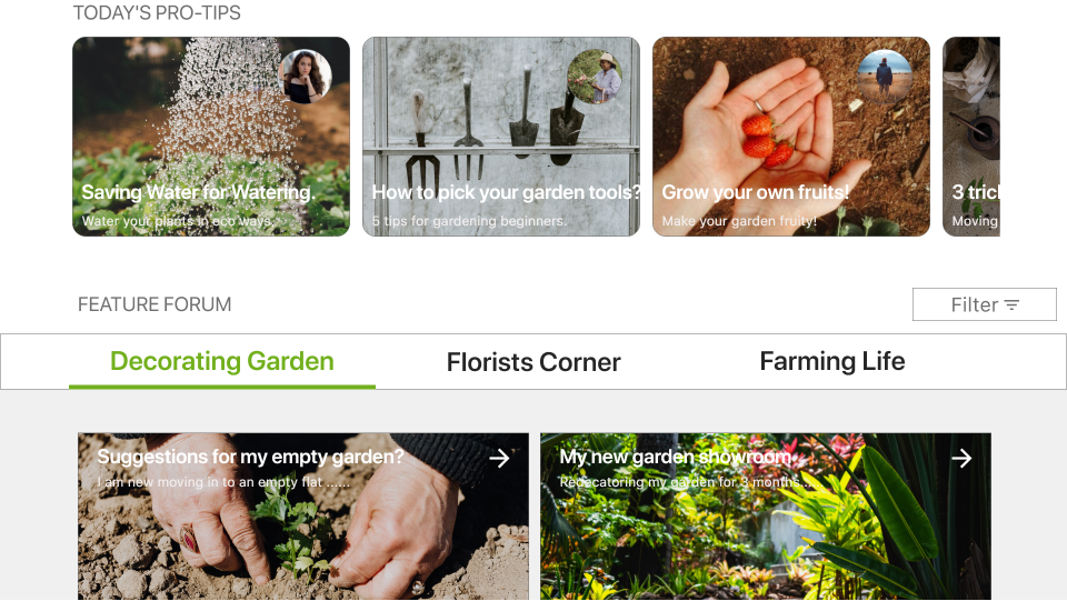
Search for interested informations in a fast & convient way.